BerryDunn is thrilled to unveil a brand refresh, including a new logo and corresponding colors and fonts.
This refresh builds upon a comprehensive rebrand that took place in 2011 when the firm changed its name from Berry, Dunn, McNeil & Parker to BerryDunn.
A brand is more than a logo and colors; it represents the experience of interacting with the firm. That’s why the rebrand began with a discovery process, including research and interviews with employees and clients alike. From this came the following seven attributes, which together form the essence of the BerryDunn brand:
Experienced – Flexible – Empowering – Independent – Engaged – Efficient – Passionate
.png)
Why now
While these core attributes remain true today, the firm has evolved significantly. “We have grown from 200 employees to 500 in the decade since we last articulated our brand identity,” said Colleen Oakley, Director of Marketing at BerryDunn. “This year, we have been having firm-wide conversations about what makes us thrive, what constitutes our culture, and why employees and clients enjoy working with us. The time felt right to revisit how people experience the brand.”
How the process engaged the whole firm
BerryDunn’s Art Director and Brand Manager Shelly Caporossi brought her advertising agency experience to this unique assignment, which, true to form for BerryDunn, involved robust employee engagement, feedback, and creative fun.
Drawing insights from employee surveys and a firm-wide logo usage audit, the marketing team determined that the new logo must:
- Be crisp, contemporary, professional
- Be powerful and highly legible in every form of media: print, digital, 3D
- Evoke the firm’s mission to create, grow, and protect value
From there, Caporossi drafted more than 60 designs and workshopped them with BerryDunn focus groups, giving employees a chance to debate color theory, typography, and symbolism. Once the field was narrowed to two concepts, the entire firm voted to determine the new logo and color palette.
What it represents
The new logo suggests optimism and energy (“create” and “grow”) with its fresh color and open shapes, confidence with its bold angles and clean font, and trusted experience (“protect”) with an arc that shields the b.
Crucially, its clean design works across varied applications, from digital icons to sky-high signage. The colors are livable and complementary across multiple environments. All together, the elements serve to enrich the brand experience in person and online.
Keeping people at the center of the brand
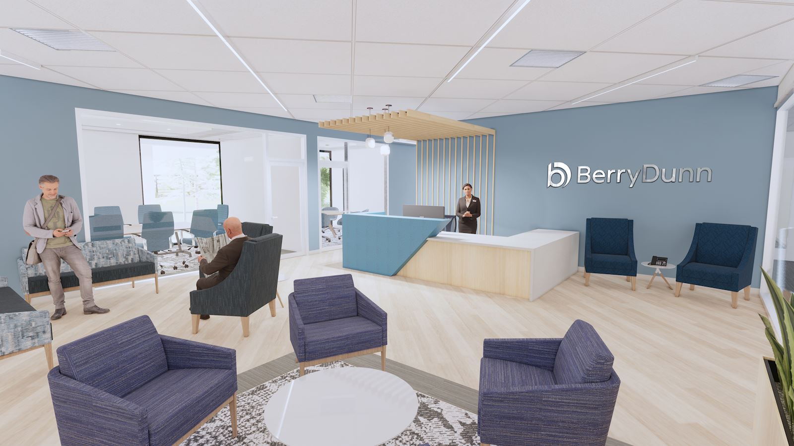
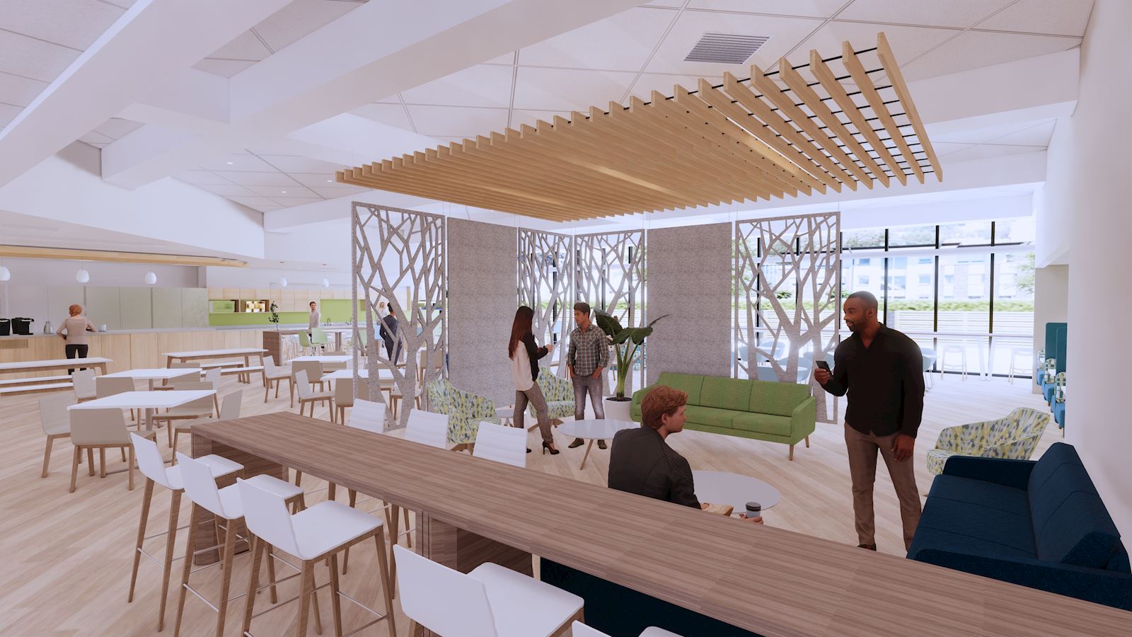
The new color palette, with its lively green and deep blue, will flow across all of BerryDunn’s digital and print communications, and will be felt throughout its office interiors.
The brand refresh coincides with the imminent opening of BerryDunn’s new headquarters, which features a rooftop sign visible to anyone entering Portland by land or air, as well as the significant expansion of BerryDunn’s Boston office. Both office buildouts were designed with the brand in mind. This will ensure a consistent and welcoming BerryDunn experience as the firm opens and renovates offices across the country.


Lavallee Brensinger Architects worked closely with BerryDunn employees to infuse the spaces with the brand. According to Emma Hyson, the interior designer, “We aimed to reflect the energy of the company culture, sometimes using playful pops of color and sometimes creating calming retreats, always keeping people’s purpose and comfort in mind.”